In 2026, we are drowning in data but starving for truth. Statistics are the most powerful tool we have for understanding the world, but they are also the most easily manipulated. To be "Math Literate" today means being able to deconstruct a headline and find the actual probability hidden beneath the noise.
The 'Mean' vs. The 'Median'
When someone tells you the "Average" salary in a room is $200,000, they are often using the Mean. If Bill Gates walks into a room of 100 people, the mean salary jumps to millions, but the Median (the middle value) remains unchanged. Always ask for the median when looking at income or wealth data.
Survivor Bias: The 'Secret to Success' Myth
Survivor bias occurs when you look at the winners and ignore the losers. If you study the habits of 10 billionaire dropouts, you might conclude that dropping out causes wealth. However, if you study the 100,000 other dropouts who didn't become billionaires, the math tells a very different story.
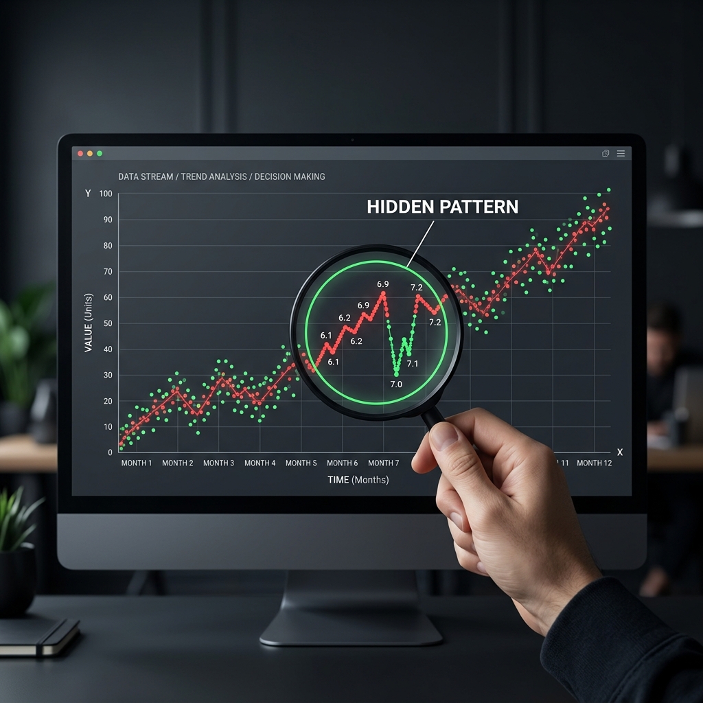
Bayes' Theorem (above) is the mathematical cure for many statistical fallacies, helping us update our beliefs based on new, filtered evidence.
Misleading Axes in Visualizations
The most common way to lie with a chart is by truncating the Y-axis. By starting a chart at 90 instead of 0, a tiny 1% change can be made to look like a massive, vertical spike. Always check the scale of the axis before reacting to the trend line.